Controlling What’s in the PlotFile
There are a few options that can be set at runtime to control what variables appear in the plotfile. See section Plotfiles.
Amrvis
Amrvis is a package developed by CCSE that is designed specifically for highly efficient visualization of block-structured hierarchical AMR data. Information on building the amrvis2d and amrvis3d executables is given in section Visualizing the Results. A very useful feature of Amrvis is View \(\rightarrow\) Dataset, which allows you to actually view the numbers in a spreadsheet that is nested to reflect the AMR hierarchy – this can be handy for debugging. You can modify how many levels of data you want to see, whether you want to see the grid boxes or not, what palette you use, etc.
If you like to have amrvis display a certain variable, at a certain scale, when you first bring up each plotfile (you can always change it once the amrvis window is open), you can modify the amrvis.defaults file in your directory to have amrvis default to these settings every time you run it. The Amrvis repository has a sample amrvis.defaults file that can be copied to your local folder and modified.
VisIt
VisIt is also a great visualization tool, and it supports AMReXAMR data natively. To open a AMReX plotfile, select File \(\rightarrow\) Open file \(\rightarrow\) Open file as type Boxlib, and choose the Header file within the plotfile folder, plt00000/Header, For more information check out visit.llnl.gov.
yt
yt is a free and open-source software that provides data analysis and publication-level visualization tools. It is geared more for astrophysical simulation results, but may be useful for your purposes. As yt is script-based, it’s not as easy to use as VisIt, and certainly not as easy as Amrvis, but the images can be worth it! Here we do not flesh out yt, but give an overview intended to get a person started. Full documentation and explanations from which this section was adapted can be found at http://yt-project.org/doc/index.html.
yt can be installed by the following commands:
$ wget http://hg.yt-project.org/yt/raw/stable/doc/install_script.sh
$ bash install_script.sh
This installs yt in your current directory. To update yt in the future, simply do
$ yt update
in your “yt-hg” folder.
AMReX Data in yt
yt was originally created for simple analysis and visualization of data from the Enzo code. Since, it has grown to include support for a variety of codes, including IAMR. However, yt will still sometimes make assumptions, especially about data field names, that favor Enzo and cause errors with AMReX data. These problems can usually be avoided by taking care to specify the data fields desired in visualization. For example, Enzo’s density field is called “Density,” and is the default for many plotting mechanisms when the user does not specify the field. However, IAMR does not have a field called “Density”; instead, the density field is called “density.” If a user does not specify a field while plotting with IAMR data, chances are that yt will try (and fail) to find “Density” and return an error. As you will see in the examples, however, there is a way to create your own fields from existing ones. You can use these derived fields as you would use any other field.
There are also a few imperatives when it comes to reading in your AMReX simulation data and associated information. First and foremost is that the inputs file for the simulation must exist in the same directory as where the plotfile directory is located, and it must be named “inputs.” yt reads information from the inputs file such as the number of levels in the simulation run, the number of cells, the domain dimensions, and the simulation time. When specifying a plotfile as the data source for plots, you may simply call it by its directory name, rather than using the Header file as in VisIt. As a final caveat, yt requires the existence of the job_info file within the plotfile directory.
The following examples for yt were taken from the Castro user guide, and so have a strong astrophysics bent to them, but is still useful in the context of combustion. The only subtlety is that Castro works in CGS units.
Interacting with yt: Command Line and Scripting
yt is written completely in python (if you don’t have python, yt will install it for you) and there are a number of different ways to interact with it, including a web-based gui. Here we will cover command-line yt and scripts/the python interactive prompt, but other methods are outlined on the yt webpage at http://yt-project.org/doc/interacting/index.html.
The first step in starting up yt is to activate the yt environment:
$ source $YT_DEST/bin/activate
From the command line you can create simple plots, perform simple volume renderings, print the statistics of a field for your data set, and do a few other things. Try $ yt to see a list of commands, and $ yt \(<\)command\(>\) –help to see the details of a command. The command line is the easiest way to get quick, preliminary plots – but the simplicity comes at a price, as yt will make certain assumptions for you. We could plot a projection of density along the x-axis for the plotfile (yt calls it a parameter file) plt_def_00020 by doing the following:
$ yt plot -p -a 0 -f density plt_def_00020
Or a temperature-based volume rendering with 14 contours:
$ yt render -f Temp –contours 14 plt_def_00020
Any plots created from the command line will be saved into a subfolder called “frames.” The command line is nice for fast visualization without immersing yourself too much in the data, but usually you’ll want to specify and control more details about your plots. This can be done either through scripts or the python interactive prompt. You can combine the two by running scripts within the interactive prompt by the command
\(>>>\) execfile(‘script.py’)
which will leave you in the interactive prompt, allowing you to explore the data objects you’ve created in your script and debug errors you may encounter. While in the yt environment, you can access the interactive prompt by $ python or the shortcut
$ pyyt
Once you’re in the yt environment and in a .py script or the interactive prompt, there are a couple of points to know about the general layout of yt scripting. Usually there are five sections to a yt script:
Import modules
Load parameter files and saved objects
Define variables
Create and modify data objects, image arrays, plots, etc. \(\rightarrow\) this is the meat of the script
Save images and objects
Note that neither saving nor loading objects is necessary, but can be useful when the creation of these objects is time-consuming, which is often the case during identification of clumps or contours.
yt Basics
The first thing you will always want to do is to import yt:
\(>>>\) from yt.mods import *
Under certain circumstances you will be required to import more, as we will see in some of the examples, but this covers most of it, including all of the primary functions and data objects provided by yt. Next, you’ll need yt to access the plotfile you’re interested in analyzing. Remember, you must have the “inputs” file in the same folder:
\(>>>\) pf = load(‘plt_def_00020’)
When this line is executed, it will print out some key parameters from the simulation. However, in order to access information about all of the fluid quantities in the simulation, we must use the “hierarchy” object. It contains the geometry of the grid zones, their parent relationships, and the fluid states within each one. It is easily created:
\(>>>\) pf.h
Upon execution, yt may print out a number of lines saying it’s adding unknown fields to the list of fields. This is because IAMR has different names for fields than what yt expects. We can see what fields exist through the commands
\(>>>\) print pf.h.field_list
\(>>>\) print pf.h.derived_field_list
There may not be any derived fields for the IAMR data. We can find out the number of grids and cells at each level, the simulation time, and information about the finest resolution cells:
\(>>>\) pf.h.print_stats()
You can also find the value and location of the maximum of a field in the domain:
\(>>>\) value, location = pf.h.find_max(‘density’)
The list goes on. A full list of methods and attributes associated with the heirarchy object (and most any yt object or function) can be accessed by the help function:
\(>>>\) help(pf.h)
You can also use \(>>>\) dir() on an object or function to find out which names it defines. Check the yt documentation for help. Note that you may not always need to create the hierarchy object. For example, before calling functions like find_max; yt will construct it automatically if it does not already exist.
Data Containers and Selection
Sometimes, you’ll want to select, analyze, or plot only portions of your simulation data. To that end, yt includes a way to create data “containers” that select data based on geometric bounds or fluid quantity values. There are many, including rays, cylinders, and clumps (some in the examples, all described in the documentation), but the easiest to create is a sphere, centered on the location of the maximum density cell we found above:
\(>>>\) my_data_container = pf.h.sphere(location, 5.0e4/pf[‘km’])
Here, we put the radius in units of kilometers using a conversion. When specifying distances in yt, the default is to use the simulation-native unit named “1”, which is probably identical to one of the other units, like “m”. The pf.h.print_stats() command lists available units. We can access the data within the container:
\(>>>\) print my_data_container[‘density’]
\(>>>\) print my_data_container.quantities[‘Extrema’]([‘density’, ‘pressure’])
When the creation of objects is time-consuming, it can be convenient to save objects so they can be used in another session. To save an object as part of the .yt file affiliated with the heirarchy:
\(>>>\) pf.h.save_object(my_data_container, ‘sphere_to_analyze_later’)
Once it has been saved, it can be easily loaded later:
\(>>>\) sphere_to_analyze = pf.h.load_object(‘sphere_to_analyze_later’)
Grid Inspection
yt also allows for detailed grid inspection. The hierarchy object possesses an array of grids, from which we can select and examine specific ones:
\(>>>\) print pf.h.grids
\(>>>\) my_grid = pf.h.grids[4]
Each grid is a data object that carries information about its location, parent-child relationships (grids within which it resides, and grids that reside within it, at least in part), fluid quantities, and more. Here are some of the commands:
\(>>>\) print my_grid.Level
\(>>>\) print my_grid_ActiveDimensions
\(>>>\) print my_grid.LeftEdge
\(>>>\) print my_grid.RightEdge
\(>>>\) print my_grid.dds
(dds is the size of each cell within the grid).
\(>>>\) print my_grid.Parent
\(>>>\) print my_grid.Children[2].LeftEdge
\(>>>\) print my_grid[‘Density’]
You can examine which cells within the grid have been refined with the child_mask attribute, a representative array set to zero everywhere there is finer resolution.To find the fraction of your grid that isn’t further refined:
\(>>>\)print my_grid.child_mask.sum()/float(my_grid.ActiveDimensions.prod())
Rather than go into detail about the many possibilities for plotting in yt, we’ll provide some examples.
Example Scripts
In these examples, we investigate 3-D simulation data of two stars orbiting in the center of the domain, which is a box of sides \(10^{10}\:cm\).
# Pressure Contours
from yt.mods import *
pf = load(‘plt00020’)
field = ‘pressure’
pf.h
# AMReX fields have no inherent units, so we add them in, in the form of a raw string
# with some LaTeX-style formatting.
pf.field_info[field]._units = r‘\rm{Ba}’
# SlicePlot parameters include: parameter file, axis, field, window width (effectively the
# x and y zoom), and fontsize. We can also create projections with ProjectionPlot().
p = SlicePlot(pf, ‘z’, field, width=((5.0e9, ‘cm’), (3.0e9, ‘cm’)),
fontsize=13)
# Zlim is the range of the colorbar. In other words, the range of the data we want to display.
# Names for many colormaps can be found at wiki.scipy.org/Cookbook/Matplotlib/Show_colormaps.
p.set_zlim(field, 2.85e13, 2.95e13)
p.set_cmap(field, ‘jet’)
# Here we add 5 density contour lines within certain limits on top of the image. We overlay
# our finest grids with a transparency of 0.2 (lower is more transparent). We add a quiver
# plot with arrows every 16 pixels with x_velocity in the x-direction and y_velocity in
# the y-direction. We also mark the center with an ‘x’ and label one of our stars.
p.annotate_contour(‘density’, clim=(1.05e-4, 1.16e-4), ncont=5, label=False)
p.annotate_grids(alpha=0.2, min_level=2)
p.annotate_quiver(‘x_velocity’, ‘y_velocity’, factor=16)
p.annotate_marker([5.0e9, 5.0e9], marker=‘x’)
p.annotate_point([5.95e9, 5.1e9], ‘Star!’)
# This saves the plot to a file with the given prefix. We can alternatively specify
# the entire filename.
p.save(‘contours.press_den_’)
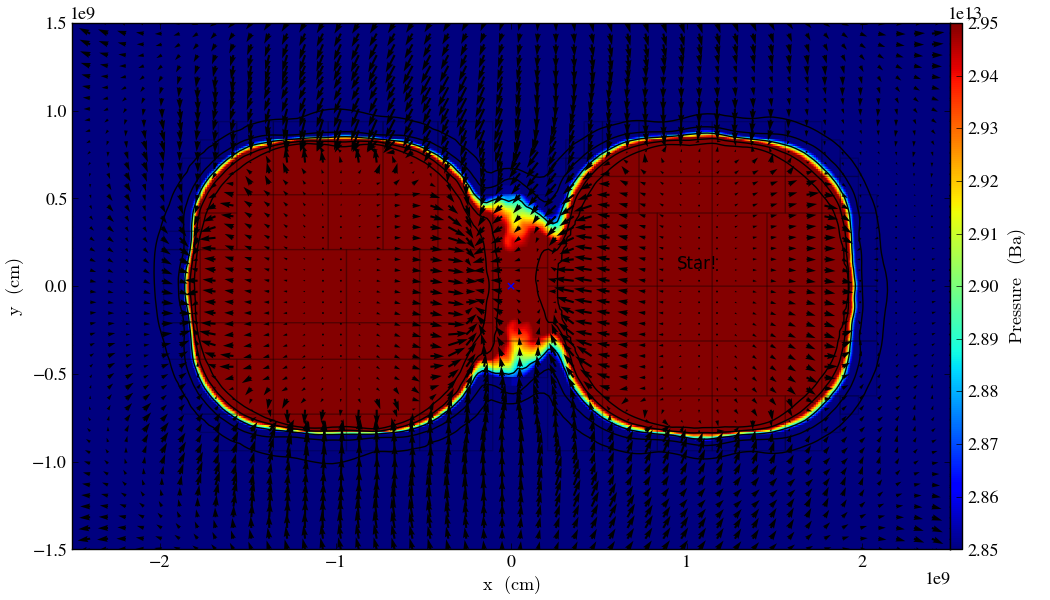
Fig. 2 Pressure slice with annotations
#————————
# Volume Rendering
from yt.mods import *
pf = load(‘plt00020’)
field = ‘pressure’ dd = pf.h.all_data()
# We take the log of the extrema of the pressure field, as well as a couple other interesting
# value ranges we’d like to visualize.
h_mi, h_ma = dd.quantities[‘Extrema’](field)[0]
h_mi, h_ma = np.log10(h_mi), np.log10(h_ma)
s_mi, s_ma = np.log10(2.90e13), np.log10(3.10e13)
pf.h
# We deal in terms of logarithms here because we have such a large range of values.
# It can make things easier, but is not necessary.
pf.field_info[field].take_log=True
# This is what we use to visualize volumes. There are a couple of other, more complex
# ways. We set the range of values we’re interested in and the number of bins in the
# function. Make sure to have a lot of bins if your data spans many orders of magnitude!
# Our raw data ranges from about :math:`10^{13}` to :math:`10^{22}`.
tf = ColorTransferFunction((h_mi-1, h_ma+1), nbins=1.0e6)
# Here we add several layers to our function, either one at a time or in groups. We
# specify the value-center and width of the layer. We can manipulate the color by
# individually setting the colormaps and ranges to spread them over. We can also
# change the transparency, which will usually take some time to get perfect.
tf.sample_colormap(np.log10(2.0e21), 0.006, col_bounds=[h_mi,h_ma],
alpha=[27.0], colormap=‘RdBu_r’)
tf.sample_colormap(np.log10(2.0e19), 0.001, col_bounds=[h_mi,h_ma],
alpha=[5.5], colormap=‘RdBu_r’)
tf.add_layers(6, mi=np.log10(2.95e13), ma=s_ma,
col_bounds=[s_mi,s_ma],
alpha=19*na.ones(6,dtype=‘float64’), colormap=‘RdBu_r’)
tf.sample_colormap(np.log10(2.95e13), 0.000005, col_bounds=[s_mi,s_ma],
alpha=[13.0], colormap=‘RdBu_r’)
tf.sample_colormap(np.log10(2.90e13), 0.000007, col_bounds=[s_mi,s_ma],
alpha=[11.5], colormap=‘RdBu_r’)
tf.sample_colormap(np.log10(2.85e13), 0.000008, col_bounds=[s_mi,s_ma],
alpha=[9.5], colormap=‘RdBu_r’)
# By default each color channel is only opaque to itself. If we set grey_opacity=True,
# this is no longer the case. This is good to use if we want to obscure the inner
# portions of our rendering. Here it only makes a minor change, as we must set our
# alpha values for the outer layers higher to see a strong effect.
tf.grey_opacity=True
# Volume rendering uses a camera object which centers the view at the coordinates we’ve
# called ‘c.’ ‘L’ is the normal vector (automatically normalized) between the camera
# position and ‘c,’ and ‘W’ determines the width of the image—again, like a zoom.
# ‘Nvec’ is the number of pixels in the x and y directions, so it determines the actual
# size of the image.
c = [5.0e9, 5.0e9, 5.0e9]
L = [0.15, 1.0, 0.40]
W = (pf.domain_right_edge - pf.domain_left_edge)*0.5
Nvec = 768
# ‘no_ghost’ is an optimization option that can speed up calculations greatly, but can
# also create artifacts at grid edges and affect smoothness. For our data, there is no
# speed difference, so we opt for a better-looking image.
cam = pf.h.camera(c, L, W, (Nvec,Nvec), transfer_function = tf,
fields=[field], pf=pf, no_ghost=False)
# Obtain an image! However, we’ll want to annotate it with some other things before
# saving it.
im = cam.snapshot()
# Here we draw a box around our stars, and visualize the gridding of the top two levels.
# Note that draw_grids returns a new image while draw_box does not. Also, add_
# background_color in front of draw_box is necessary to make the box appear over
# blank space (draw_grids calls this internally). For draw_box we specify the left
# (lower) and right(upper) bounds as well its color and transparency.
im.add_background_color(‘black’, inline=True)
cam.draw_box(im, np.array([3.0e9, 4.0e9, 4.0e9]),
np.array([7.0e9, 6.0e9, 6.0e9]), np.array([1.0, 1.0, 1.0, 0.14]))
im = cam.draw_grids(im, alpha=0.12, min_level=2)
im = cam.draw_grids(im, alpha=0.03, min_level=1, max_level=1)
# ‘im’ is an image array rather than a plot object, so we save it using a different
# function. There are others, such as ‘write_bitmap.’
im.write_png(‘pressure_shell_volume.png’)
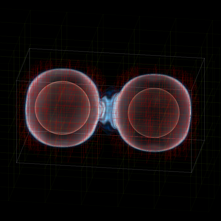
Fig. 3 Volume rendering
#————————
# Isocontour Rendering
# Here we extract isocontours using some extra modules and plot them using matplotlib.
from mpl_toolkits.mplot3d import Axes3D
from mpl_toolkits.mplot3d.art3d import Poly3DCollection
import matplotlib.pyplot as plt
from yt.mods import *
pf = load(‘plt00020’)
field = ‘pressure’
field_weight = ‘magvel’
contour_value = 2.83e13
domain = pf.h.all_data()
# This object identifies isocontours at a given value for a given field. It returns
# the vertices of the triangles in that isocontour. It requires a data source, which
# can be an object—but here we just give it all of our data. Here we find a pressure
# isocontour and color it the magnitude of velocity over the same contour.
surface = pf.h.surface(domain, field, contour_value)
colors = apply_colormap(np.log10(surface[field_weight]), cmap_name=‘RdBu’)
fig = plt.figure()
ax = fig.gca(projection=‘3d’)
p3dc = Poly3DCollection(surface.triangles, linewidth=0.0)
p3dc.set_facecolors(colors[0,:,:]/255.)
ax.add_collection(p3dc)
# By setting the scaling on the plot to be the same in all directions (using the x scale),
# we ensure that no warping or stretching of the data occurs.
ax.auto_scale_xyz(surface.vertices[0,:], surface.vertices[0,:],
surface.vertices[0,:])
ax.set_aspect(1.0)
plt.savefig(‘pres_magvel_isocontours.png’)
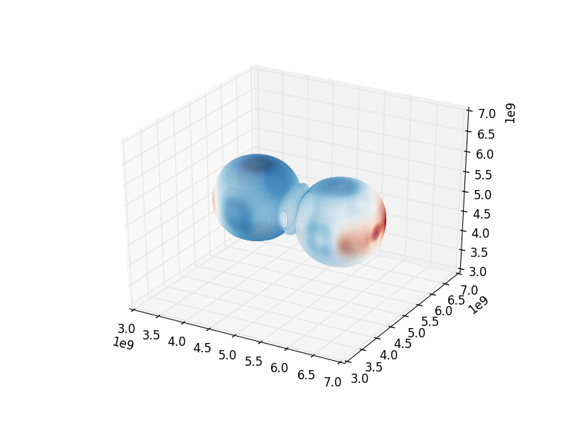
Fig. 4 Pressure isocontour rendering colored with velocity magnitude
#————————
#1-D and 2-D Profiles
# Line plots and phase plots can be useful for analyzing data in detail.
from yt.mods import *
pf = load(‘plt00020’)
pf.h
# Just like with the pressure_contours script, we can set the units for fields that
# have none.
pf.field_info[‘magvel’]._units = r‘\rm{cm}/\rm{s}’
pf.field_info[‘kineng’]._units = r‘\rm{ergs}’
# We can create new fields from existing ones. ytassumes all units are in cgs, and
# does not do any unit conversions on its own (but we can make it). Creating new fields
# requires us to define a function that acts on our data and returns the new data,
# then call add_field while supplying the field name, the function the data comes from,
# and the units. Here, we create new fields simply to rename our data to make the plot
# look prettier.
def _newT(field, data):
return data[‘t’]
add_field(‘X’, function=_newT, units=r‘\rm{domain}\rm{fraction}’)
def _newDen(field, data):
return data[‘density’]
add_field(‘Density’, function=_newDen, units=r‘\rm{g}/\rm{cm}^{3}’)
# PlotCollections are one of the most commonly used tools in yt, alongside SlicePlots and
# ProjectionPlots. They are useful when we want to create multiple plots from the same
# parameter file, linked by common characteristics such as the colormap, its bounds, and
# the image width. It is easy to create 1-D line plots and 2-D phase plots through a
# PlotCollection, but we can also create thin projections and so on. When we create a
# PlotCollection, it is empty, and only requires the parameter file and the ’center’ that
# will be supplied to plots like slices and sphere plots.
pc = PlotCollection(pf, ‘c’)
# Now we add a ray—a sample of our data field along a line between two points we define
# in the function call.
ray = pc.add_ray([0.0, 5.0e9, 5.0e9],[1.e10, 5.0e9, 5.0e9], ‘magvel’)
# This is where our derived fields come in handy. Our ray is drawn along the x-axis
# through the center of the domain, but by default the fraction of the ray we have gone
# along is called ‘t.’ We now have the same data in another field we called ‘X,’ whose
# name makes more sense, so we’ll reassign the ray’s first field to be that. If we wanted,
(# we could also reassign names to ‘magvel’ and ‘kineng.’
ray.fields = [‘X’, ‘magvel’]
# Next, we’ll create a phase plot. The function requires a data source, and we can’t
# just hand it our parameter file, but as a substitute we can quickly create an object
# that spans our entire domain (or use the method in the isocontour example). The
# specifications of the region (a box) are the center, left bound, and right bound.
region = pf.h.region([5.0e9, 5.0e9, 5.0e9], [0.0, 0.0, 0.0],
[1.0e10, 1.0e10, 1.0e10])
# The phase object accepts a data source, fields, a weight, a number of bins along both
# axes, and several other things, including its own colormap, logarithm options,
# normalization options, and an accumulation option. The first field is binned onto
# the x-axis, the second field is binned onto the y-axis, and the third field is
# binned with the colormap onto the other two. Subsequent fields go into an underlying
# profile and do not appear on the image.
phase = pc.add_phase_object(region, [‘Density’, ‘magvel’,‘kineng’], weight=None,
x_bins=288, y_bins=288)
pc.save(‘profile’)
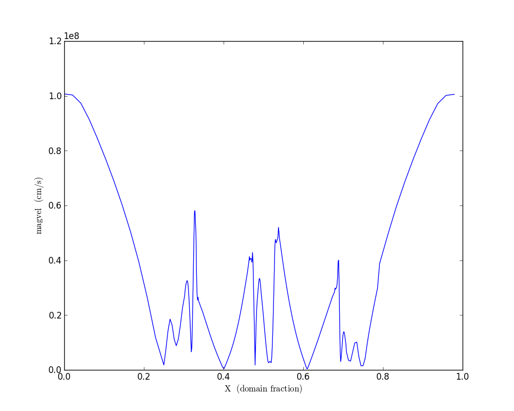
Fig. 5 Density/velocity magnitude/kinetic energy phase plot

Fig. 6 Density/velocity magnitude/kinetic energy phase plot
#————————
#Off-Axis Projection
# If we don’t want to take a projection (this can be done for a slice as well) along
# one of the coordinate axes, we can take one from any direction using an
# OffAxisProjectionPlot. To accomplish the task of setting the view up, the plot
# requires some of the same parameters as the camera object: a normal vector, center,
# width, and field, and optionally we can set no_ghost (default is False). The normal
# vector is automatically normalized as in the case of the camera. The plot also
# requires a depth—that is, how much data we want to sample along the line of sight,
# centered around the center. In this case ‘c’ is a shortcut for the domain center.
pf = load(‘plt00020’)
field = ‘density’
L = [0.25, 0.9, 0.40]
plot = OffAxisProjectionPlot(pf, L, field, center=‘c’,
width=(5.0e9, 4.0e9), depth=3.0e9)
# Here we customize our newly created plot, dictating the font, colormap, and title.
# Logarithmic data is used by default for this plot, so we turn it off.
plot.set_font({‘family’:‘Bitstream Vera Sans’, ‘style’:‘italic’,
‘weight’:‘normal’, ‘size’:14, ‘color’:‘red’})
plot.set_log(field, False)
plot.set_cmap(field, ‘jet’)
plot.annotate_title(‘Off-Axis Density Projection’)
# The actual size of the image can also be set. Note that the units are in inches.
plot.set_window_size(8.0)
plot.save(‘off_axis_density’)
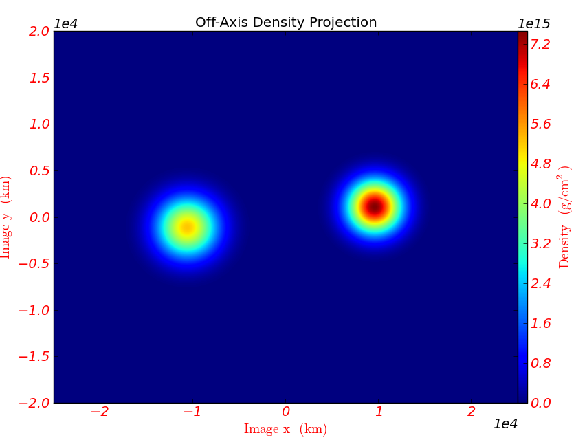
Fig. 7 Off-axis density projection